
QuickFit
Try out the protoype - QuickFit prototype
QuickFit believes that no matter what your fitness level is or how hectic you are, staying active can be fun and part of your lifestyle.
What differentiates QuickFit is its approachable attitude toward exercise. We’re real people with busy lives. Do a 5-minute workout at home or at your desk. Whenever and wherever you want to be active, find a tailored workout with QuickFit.
Role
UI Designer
Low- to high-fidelity wireframing, color and typography, prototyping.
Tools
Paper & pencil, Adobe XD, Photoshop, Figma (prototype), UsabilityHub, Draw.io, QuickTime.
01 OVERVIEW
Challenge
Design a responsive app that motivates people into an exercise routine fitting their activity level, schedule, and interests.
Deliverable
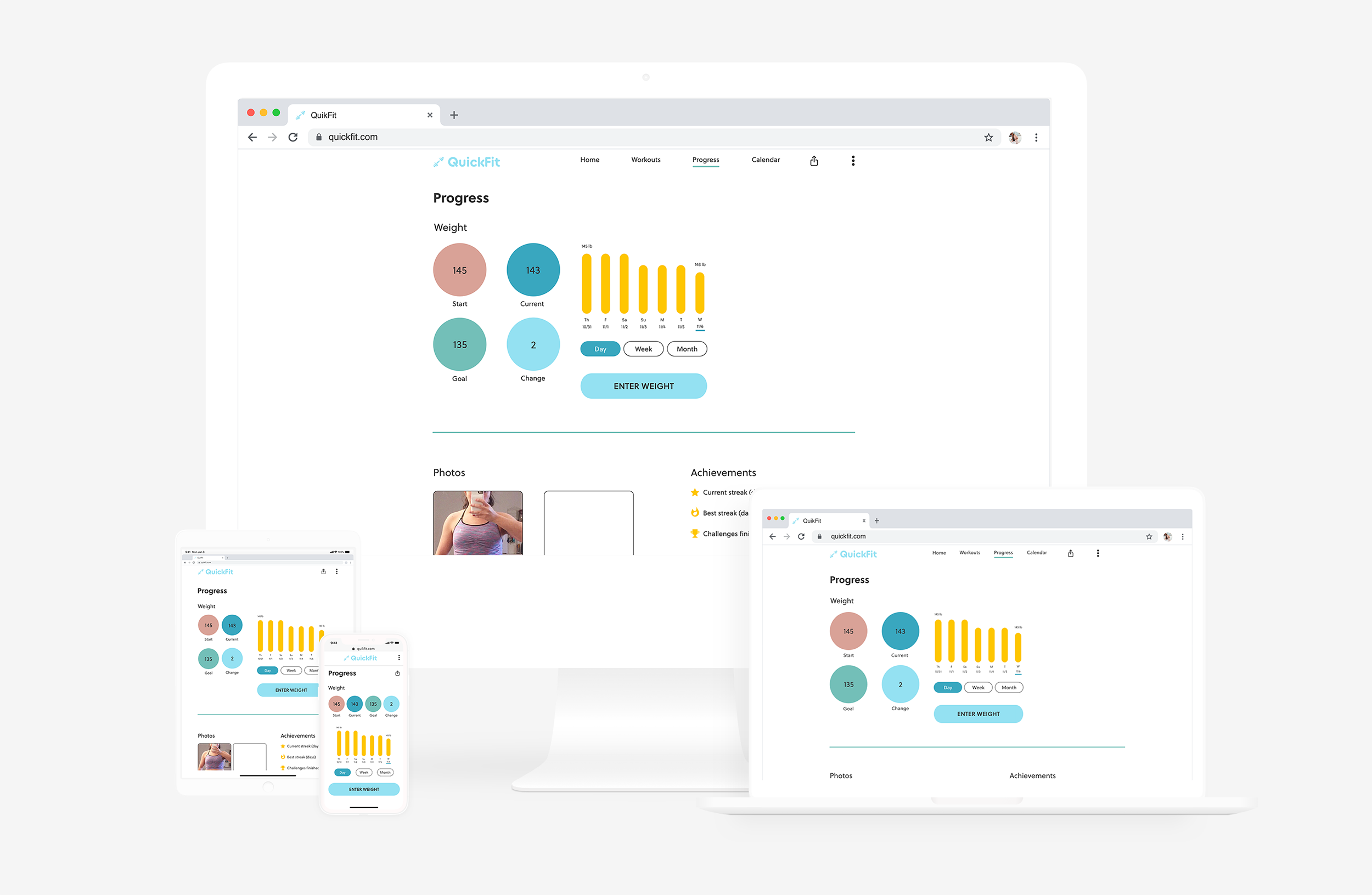
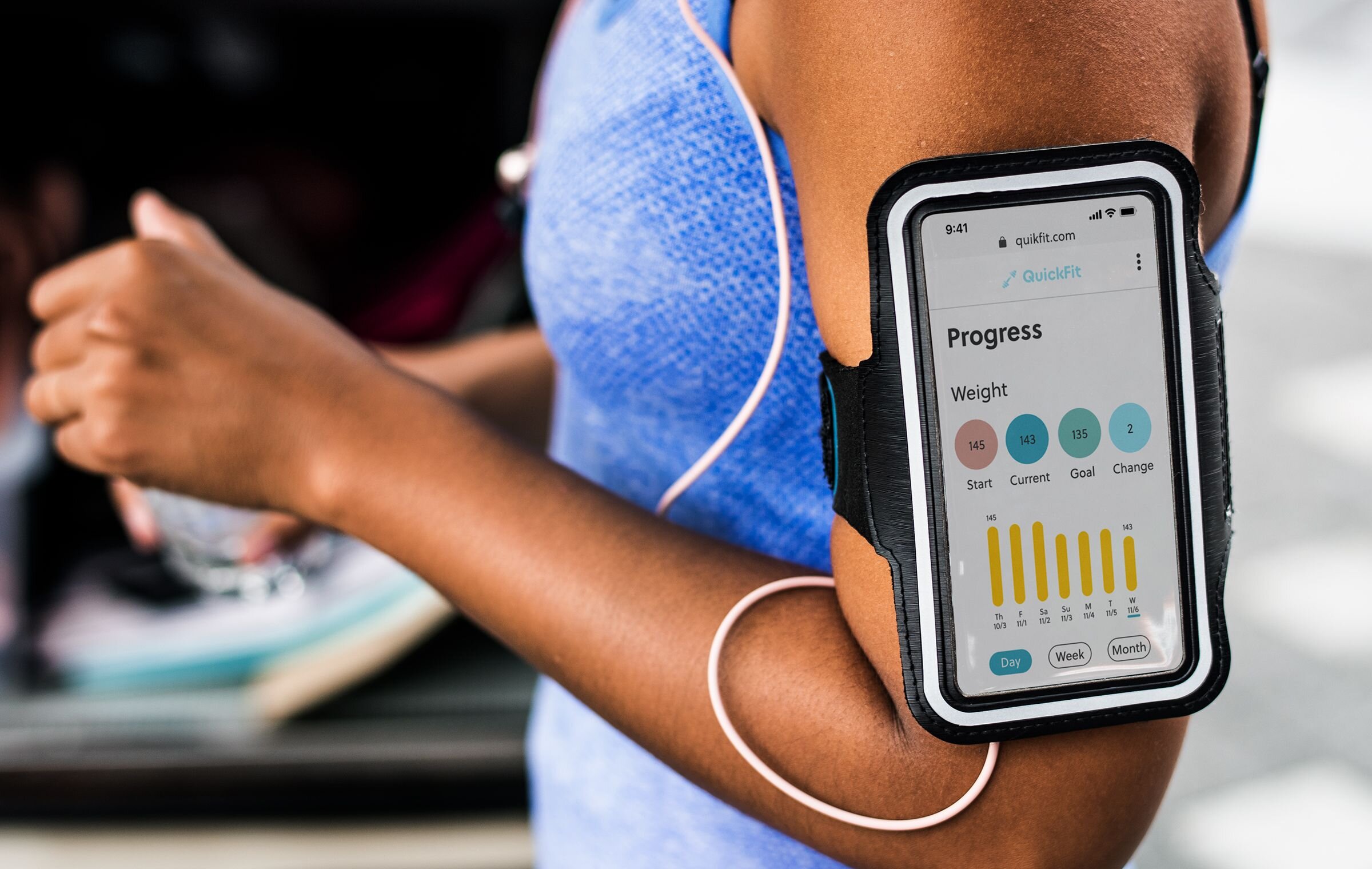
Responsive web app. Mobile-first design.
Target Audience
Anyone new or returning to exercise who wants to start a fitness routine.
Timeline
2 months.
02 RESEARCH
User Needs
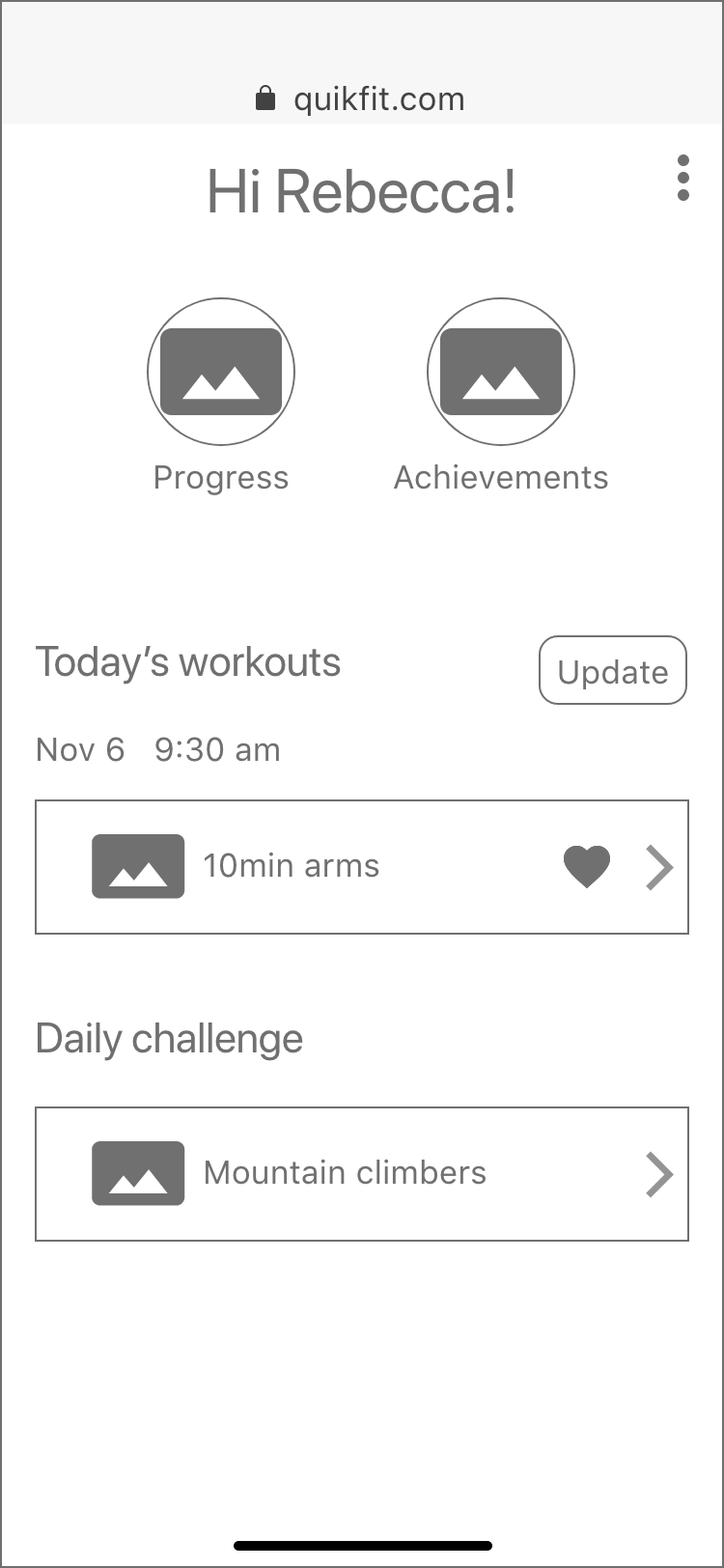
The creative brief and persona (software developer Rebecca) identified three primary users needs:
A way to find exercises that fit their interests and their busy lives.
A way to plan workouts to get into a routine.
A way to stay motivated.
Key Features
I began by conducting competitive research on other fitness apps and found key features that would help address user motivations and needs.
Filtering (discover exercises based on interests, time, and fitness level).
In-app calendar (schedule workouts).
Daily challenges (motivate users with quick exercises they can easily do on non-workout days or in addition to a scheduled workout).
03 USER FLOWS
Key features were turned into user flows.
04 WIREFRAMES
QuickFit was designed mobile-first. Keeping user flows in mind, I did a Crazy-8s session to sketch out potential design solutions.
Low-Fidelity
Then I created low-fidelity wireframes in Adobe XD of the top choices.


Mid-Fidelity
I applied design principles, hierarchy, and spacing which refined the mid-fidelity wireframes. As a responsive app, all content aligns to a 12-column grid.
The first set of mid-fidelity frames used both a serif and sans serif font pairing, but it felt a little off. A preference test on UsabilityHub showed that 88% of 17 respondents preferred sans serif only. QuickFit has a modern feel so using a contemporary sans serif font like Soleil works well.
Also, I revised the app’s name from Fitted to QuickFit.


05 MOODBOARDS
Moodboard 01
Confident, young, modern, fun, personable.
Staying active fits your lifestyle.
Moodboard 01
Moodboard 02
Strong, gritty, urban, cool.
Just do it.
Moodboard 02
I chose Moodboard 01 for the design direction since it aligns better with the creative brief. Busy people who are new or getting back into fitness (WHO) want the flexibility to use the app whenever and wherever it fits their schedule (WHEN and WHERE).
Moodboard 01 is confident, young, modern, fun, and personable. That should appeal to our persona, Rebecca, who’s in her mid-20s and works in tech.
06 COLOR PALETTE
Color Palette Options
Confident, young, modern, fun, personable. Being active can fit your lifestyle. To apply this feel to QuickFit, I created three color palettes and decided on a modified palette #1.
Final Color Palette
The lighter blue (#94E1F2) felt more modern than its palette #3 counterpart.
Orange (#FEC601) from palette #3 is poppier and more energetic than either orange from palette #1.
The muted darker blue, green, and red feel fresh, subtle, and approachable. Blue and green combined with orange and red are somewhat complementary, adding energy but not too much. I didn’t want QuickFit to feel like a “gym”.
Green from palette #3 indicates successfully completed minor tasks (ex. creating an account) and is another accent color.
The dark grey used for copy is crisp against the white background.
Each color is applied in small doses against a white background maintaining the modern and approachable vibe.
07 ANIMATIONS
08 STYLE GUIDE
View the complete Style Guide.


09 FINAL DESIGN


Try out the protoype - QuickFit prototype